

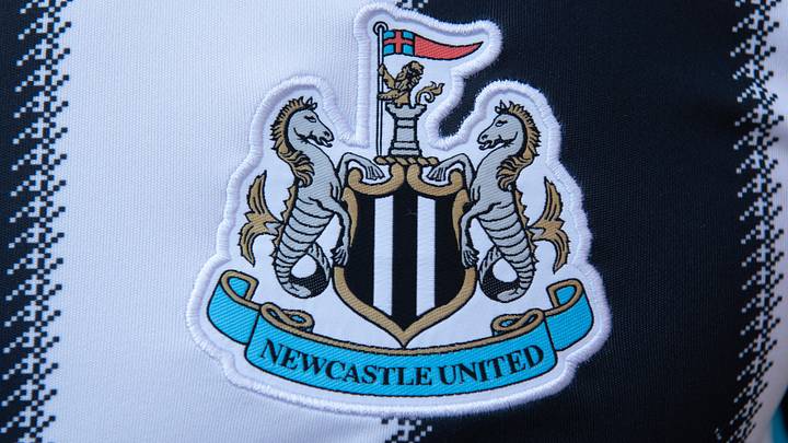
Newcastle United have today officially confirmed their new club badge after two years of deliberating and consultation with fans.
It must be noted that, if we had our way, they wouldn’t have changed the badge at all, but the commercial reasoning behind it does make sense and, to be fair, the direction they have chosen is probably as good as we could have asked for.
Yet, whilst the badge itself feels like a pretty good modern representation of the old one, it is perhaps the rest of the club’s new branding to go alongside it that raises the most questions and unrest.
Aligned branding makes sense, but maybe not this
Alongside the main badge, the Magpies have confirmed their other new pieces of branding that will be plastered across the lifestyle releases, training kit and all the little extras that come with modern day football.
But they don’t exactly hold up to the quality of the new badge itself and I’m not too sure many will be happy.
In the past few years, Newcastle have often used that familiar rounded crest with the castle and Magpie, which was initially used as the club’s actual badge from 1976-1983. In fact, it is even on this year’s away kit.
It would appear that badge, which was held so dearly by fans, has now been replaced by one which I’m not sure could be much worse.
The circular shape is still there with ‘Newcastle United’ written around the edge, but the centre has been replaced by a blacked out castle-type shape which actually looks like something from space invaders.
There are then two more badges, one which does not use a border and is simply the aforementioned castle with the club name written below it, and one which is literally just the castle.
These added badges are said to be part of the Magpies wider branding strategy, which includes a new typeface/font that will be used across all of the club’s marketing from now on.
In the video to accompany the change, it was stated that the decision took into account all the views of Newcastle fans and, while that is the case for the actual badge (which is the good bit) I’m not sure any of us would have signed off on the other crests that have been unveiled with it had we been consulted about those.
It’s all well and good keeping the badge as similar as possible whilst optimising it for modern technology and claiming that you didn’t want to modernise it too much along the way. But we then can’t brush over the fact it seems they have done exactly that with every other crest created.
The video is good
I don’t want to turn this into some negative piece because, quite frankly, I actually really like the new main badge and the video to go alongside it was excellent, showing the club really did think about what they were doing.
The little nods to the historical eras of Newcastle United on the pitch, the details which prove they have really thought about how to preserve what the crest means historically.
The montage toward the end which captured how the badge will be displayed across a multitude of marketing and branding campaigns was genuinely helpful to understand the vision going forward.
So, all things considered, I do think the club has done about as good a job as they could have under the circumstances and with a fanbase who were going to scrutinise every detail no matter what.
Perhaps the only thing they should have thought about was how some of the added crests don’t align too well with the culture and direction they were attempting to protect.
 Add us as a preferred source on Google